Wednesday, 29 February 2012

Invitation Idea


I also designed a version of an invitation. I chose to use a polaroid style.


I was quite pleased with this invitation idea. I liked the idea of using where, when and why to answer the simple questions that people could ask when they picked up the invitation.

Within our group we will come up with a number of invitation and flyer ideas, so we will take the best bits from each idea.


Website Design


Our individual group task for this week was to come up with some graphics for the website. I came up with a header idea.


We decided last week that the name of the Exhibition will be 'Retro Resolution'. This means that I we were able to start designing different ways of representing that.

We also decided that we will use bright colours combined with black backgrounds.

Visit to ICT Services


I went along with Steve the other day to visit ICT Services. They said that they would be able to lend us equipment such as projectors and headphones. We need to establish within the class who will need headphones and who will need the projector.

There is some debate between those of us displaying sound, as they were created with images. Some of us will hapily display the sound without the images but some may want the images too. We will have to think of a solution to this.

The one thing that ICT services couldn't lend us was a laptop. We will therefore have to come up with our own laptop to display the media. If we wanted a seperate area for sound and video, we would need two laptops.

Tuesday, 28 February 2012

Plastic and Transparent Cards


I have researcherd into different prices for using alternate materials on business card. I have looked at a few examples of sites that sell them. These are the prices I found.


http://www.plasmadesign.co.uk/gbp-price-list/


http://www.eyecatchers.co.uk/product/printed-plastic-cards/


http://www.cpcards.co.uk/frostedprices.html


The prices vary but so does the quality. By looking at examples on the sites, the top set is definitely the card design I would want to go with but it is fairly expensive. The second appears cheap at first, until you consider that the price is increased by £50 every time a colour is added. My previous design has 4 colours, so I would be looking at £204 for 100 cards. The final site appears the cheapest by a long way, offering 250 cards for £80. I would need to see some more examples of these cards, but this one may be the best option if my design is good enough.


Logo Complete?


Here is my first draft of my logo. I am very pleased with it. I have added in eagle wings round the side using illustrator.


Monday, 27 February 2012

Logo Ideas


I have been thinking about coming up with a logo for myself. After doing some drawing I decided I would try to combine my two initials together to make a unique shape.

I came up with the idea of combining J and E and using the same spine for both letters. My two results are as follows.


Personally, I prefer the first logo. Although the second captures the curve of the J better, I think the first is smarter and looks more professional. These are only temporary colours at the moment, I will change the colours when I have decided on them.


Sunday, 26 February 2012

CV Ideas


I have come up with a possible CV idea this weekend. I have not had a chance to revise my icons yet so I am just using the old ones for this draft. I have two possible ways of conveying information, but the second would require 2 pages which can be awkward.

This idea was to put the different sections in boxes. For this idea I have stuck to the black and white colour scheme that I used in my last business card idea and the icons at the top display the key skills.


The problem with this idea is that all the boxes need to be the same size. Some sections will be shorter so this would look strange if certain boxes are more empty.


This is the second idea that will span more than one page. However, the boxes can be as long as they need to be before they are cut off. This approach is neater in my opinion.


Wednesday, 22 February 2012

My Bio


This is a rough bio for the website or my cv. I will change this later on when I find out how long our bio is actually meant to be on website/exhibition boards.

"

 Hello there, I'm Jack.

I came to university to broaden my skills within the subject of Multimedia and to learn how to do new things. I enjoyed school for seven years and came away with 11 GCSEs and 4 A Levels. I have always been hard working and able to meet deadlines.

I enjoy a range of different work types, whether it be from sound designing or photography, web design or film-making, I do my best to find a way to adapt and produce the work that is required.

I am competent in a range of different software including Microsoft Office, Adobe Creative Suite, Logic Pro and 3ds Max. I am also always willing to learn how to do new things and improve my knowledge of different software.

There are many different interests that I have including music, sport, video games and comedy. I play the guitar and have a huge interest in both listening to music, going to live events and playing it myself. I am an avid watcher of both football and cricket and do my best to watch Essex play every year at home.

"

Friday, 17 February 2012

1980s Colours


Now we have decided on our theme we can get working properly towards the exhibition. To start with I have had a research into the different colours. We have decided as a group to do a 'Retro' exhibition, based mainly on the 1980s. I had a scan of the Internet to find some common colours.


It was a very bright time, lots of colour and exuberance. We will certainly have to consider this when designing the invitations, flyers, posters etc. We will need to be careful with this colour though, because we do not want it to distract people from the most important thing, which is our work.

A reallyu good idea was raised during the theme presentations and it was suggested that everyone has their own small avatar to help represent their work. This would be very useful, as people can identify someone with a small cartoon more easily than with a word. This wouls also be very useful because some of us will have work that is being displayed away from our individual boards, such as sound and video work. This icon will be very useful to help identify those people.

I was having a look on the Internet and I stumbled upon these images. It seems too good to be true... as there are 20 of us! I'm sure we will use some other characters such as Sonic too.


Sources

http://www.80sactual.com/2011_06_01_archive.html

http://www.thefashionpolice.net/2007/09/fashion-crimes-of-the-80s.html

http://fancydressuk.org/1980s-fancy-dress/

http://i.ebayimg.com/00/$%28KGrHqYOKpUE4kQ-BlwSBOS+VSR81!~~48_35.JPG

http://www.balconyshirts.co.uk/Retro-Accessories/Sunglasses/p1433_sc1331_it362_image.aspx

http://www.artknowledgenews.com/Gunther_Forg.html

http://www.spritestitch.com/?p=89

http://en.wikipedia.org/wiki/Game_Boy

http://www.cmybacon.com/2010/05/pacman-ghosts/

Business Card Idea 2 - Icons


I have put together a business card design with my new thoughts and ideas. I currently have two colour schemes but am trying to come up with more. I have also had a think about different fonts, I want a smart font that fits in with the theme. I am going to try to download some new fonts for my next idea.


My first idea was this one. I liked the idea of a strip in the middle containing the icons. After thinking about this more though I have decided that the blue is too harsh compared to the black and the contrast is a bit overpowering. I have left space in the top right hand corner incase I develop a logo.


Next, I developed the idea of putting the icons in rings. I still used blue, but a softer blue in this case. This one works better than the previous one, it is more plesant to look at and the icons are more easy to see against the white strip. 

Finally I switched the colours. I swapped the black and white. Again this is quite effective as it draws attention towards the middle. Using the rings around the icons means they stand out nicely.

I am far more pleased with this idea than I was with the previous one a few weeks back. I need to develop a logo and to try out some new fonts. I may also edit the icons slightly as there are some imperfections, including the web logo and the sound design one.

Business Card Iconography


I have created some of my own icons that I could potentially use for my business card. I took inspiration from the previous research I conducted.


This is the image of multimedia I gathered beforehand. I particularly liked the images in the bottom right hand corner as they were simple and conveyed a visual message as to what they represent. I decided I want this business card idea to represent four topic areas that I am interested in.

  • Sound Design
  • Photography
  • Film Making
  • Web Design
I used real photos that I have taken myself and imported them into Photoshop. By turning down the contrast I was left with simple outlines of recognisable shapes. To create the Web outline on the far right, I used a circle in Photoshop and used Distort, Spherise. I used neutral colours to start with as this is only a first idea. I will come up with a few different colour schemes for my next business card design.


 I will need to consider the colour of the text on the web icon. It needs to stand out enough to be readable. I may also need to reconsider the sound design icon to maybe include a pair of headphones or something that will ensure the message is clearer.

Thursday, 16 February 2012

Analysing my Adjectives


After looking at the images that I either drew myself or used to represent my adjectives, I am now going to have a look at the colours used and apply some of the colour research to them. This will help me choose my colours for my CV and Business card.

The main colours I used were black, white and grey. There was also splashes of colour in some of them, such as yellow and green. This indicates that I like contrasting colours, in particular black and white.

Going back to my previous research, I found out that black symbolises power, sophistication and elegance. However it can connotate death, darkness and the unknown. White, on the other hand, connotates cleanliness, purity, innocence and safety. It can symbolise coldness and winter too.

One of my favourite colours is blue. This is considered a calming colour, associated with experience and stability. However it can symbolise coldness and depression.

This means my next business card design will contain black and white as its main colours. I may use a splash of another colour if needed to make something stand out. My next idea will use the icons that I have made, similar to those found in my previous research blog post.


Wednesday, 15 February 2012

Adjectives and Thoughts


Here is the list of adjectives that I have come up with towards my portfolio. I need to think about myself before I can design a proper cv and business card that are suitable for me. The colour research
that I have carried out previously to this will be very useful here.


·         I am Friendly 


·         I am Loyal 


·         I am Organised 


·     I  am Punctual


·         I am able to meet deadlines 


·         I enjoy playing Guitar 


·         I am Interested in technology 


·         I can use different software


Sources

http://img156.imageshack.us/img156/3509/smileyfacerd1.jpg

http://dragonartz.files.wordpress.com/2009/07/vector-handshake-prev2-by-dragonart.jpg?w=495

https://blogger.googleusercontent.com/img/b/R29vZ2xl/AVvXsEhLcBYZ6ZMiZv7_7iXkzv8fBsSzJ9GjtZIPett6a7PAX6mbZRopW5P_JIAhvEvkHjq0zUuKk4xPpyPLszqQLXvkQEs529O1WSkQMq9LRdp2MiPN4UN0dvAOlsz7ROYM9Fe2ew04XC8eFR4/s1600/7781computer_chip_background_copy.jpg


Tuesday, 14 February 2012

Work to Display

I have been considering which work to display on exhibition week. Two pieces are for definite but the final piece is a bit trickier to decide.

Piece one: Advanced Sound Techniques - City Storm


This is a potential title page for the sound piece. I know some other students are considering displaying sound work as well, so we would need to consider displaying them all in the same place in the exhibition. We would need to find an icon that would identify the work as sound, an example could be the headphones at the top of this title page. This page was themed specially for my sound work using noise and motion blur in Photoshop.


Piece two: Digital Imaging Software - Photography - Guitar


This is one of my favourite photographs from the module last year. This also fits in well with my seemingly apparent 'sound and music' that seems to find its way into my work! This could be displayed just on the poster itself, the camera that the photo was taken on was of a high enough resolution that it can be printed off A4 no problem.

Piece Three - Photograph or other work?

I have a decision to make with my final piece. I could use another photograph but am reluctant to do so as I am already using one. I need to have another look back through my work and try to find something different, otherwise I will have to use two photographs for the exhibition.


Group Theme Idea


Our group theme idea for the presentation this week is 'Retro'. We want to use themes from years gone by, predominately from the 1980s. We think this would work really well as an exhibition theme and would use nostalgia to keep people interested.


There are lots of different topics that we could use throughout the exhibition. We may also use images from the 1980s that have been modernised, such as the one below.


Sources
http://www.norskfolkemuseum.no/thumbs/thumb_480x_bw__PageFiles_2951_Rubrikskube1.jpg
http://www.wayfarerssunglasses.com/40509_b.jpg
http://upload.wikimedia.org/wikipedia/en/thumb/e/ee/Ghostbusters_logo.svg/220px-Ghostbusters_logo.svg.png
http://us.123rf.com/400wm/400/400/wdesigns/wdesigns0805/wdesigns080500050/3084895-dirty-old-1980s-style-cassette-player-radio-against-a-white-background.jpg
http://unrealitymag.com/wp-content/uploads/2010/06/pacman_11.jpg
http://upload.wikimedia.org/wikipedia/en/thumb/d/db/LiveAidlogo.jpg/230px-LiveAidlogo.jpg
http://walyou.com/wp-content/uploads/2008/10/new-pacman-game-pumpkin.jpg

Thursday, 9 February 2012

Colour Wheel


It is important that I research colours before I consider them for my business card and CV. Different colours have different connotations, so it is vital that the correct message is sent out to those viewing it. Using the wrong colours could have a very negative effect on my work. 


The relationship between colours is very important. Contrast has to be used carefully and it is vital that colours do not clash. This is very important when considering fonts.


Complimentary colors are colors that compliment each other well and are located opposite of each other on the color wheel. These are colors like blue and orange, purple and yellow, and red and green.
Analogous colors are those located right next to each other on the color wheel, so they usually match fairly well but provide little contrast when used together.

Red - Often symbolises power, passion and importance. However it can connotate anger and aggression.

Orange - Symbolises joy and sunshine as well as other cheerful emotions. Can symbolise ignorance and deceit.

Yellow - Positive, happiness, intelligence, energy and optimism. However it can bring about feelings such as laziness and jealousy.

Green - Natural, healing and harmony. Green is considered 'safe' (this is why green is used in hospitals). It can however symbolise money, greed and jealousy. 

Blue - Peaceful and calming colour symbolising stability and experience. However, blue can connotate coldness and depression.

Purple - Royalty, wealth, luxury. It can also symbolise magic. Purple can lead to sadness though.

Black - Power, elegance, sophistication. However, can symbolise the unknown, darkness and death.

White - Purity and innocence, cleanliness and safety. Can also connotate coldness and winter.


Sources

http://sixrevisions.com/web_design/a-look-into-color-theory-in-web-design/

http://www.digitalskratch.com/color-psychology.php

Wednesday, 8 February 2012

Business Card Theme Thoughts


I need to work on a theme for my business card. I want to use logos on the card to indicate the different areas that I can offer. To get some ideas I simply Googled 'Multimedia' and got exactly the sort of thing I was looking for!


Seeing as Multimedia is such a broad topic, there is lots of different imagery that is used. I need to be more subtle with my designs and I think using icons to represent my skills is perfect for this. I need to have a think about colours too, I want to use neutral colours such as black, white and greys with odd bits of colour to make certain things stand out.

My personal favourite images from the collection above are the bottom right ones. I like the simplicity, it's easy to work out which field each image relates too, without directly telling you.

Sources

http://2.bp.blogspot.com/-5IpUIp9dI44/TasJWW8FuvI/AAAAAAAAARo/1TT5J3EPfHo/s1600/istockphoto_4510501-multimedia-icons-color.jpg

http://www.shutterstock.com/pic-63854659/stock-vector-multimedia-icons.html

http://www.allfreelogo.com/rf-vector/8589222-multimedia-icons-vector.html

http://www.freeiconsweb.com/Free-Downloads.asp?id=1238


Tuesday, 7 February 2012

Chelmsford Museum


After visiting Chelmsford museum I was able to get a better idea as to how certain galleries display their items. The museum I went to had a large range of exhibits, displaying items from the wars, marconi, local art and many others, as well as providing many educational pieces about the county and this town. The museum is situated inside Oaklands House, which means it has a large amount of space. 


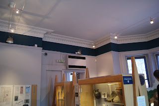
Some of the exhibition rooms had large windows that allowed plenty of light in. This meant that external lighting was not needed during the day. 


The room did have some spotlights on the ceiling for evening guests. It was hard to tell how effective these would be when I was there. We will have to ensure that there are enough lights at our exhibition, as the location doesn't have any natural lighting from one side.


This piece of art was interesting because it was placed against a wall in the middle of the room. It was used to break up the room to make it look less empty. The space we have for our exhibition is huge, so we will definitely need to put in things that will fill the space.


This room is the traditional exhibition room when I think of one. A room with white walls, a centre piece and pictures around the outside. We will have to assess the different types of work that people want to use in the exhibition.


The photos along the wall were all level in height and all used the same frame. We will need to consider this when choosing our theme. There will need to be continuity between the pieces of work to make sure that nothing looks out of place.


This was an interesting technique used. Items were displayed on the wall and they each had a different number on them. Underneath there was a chart explaining what each of the numbers are. This could be useful if we were displaying photographs on a board, the descriptions could be found below the artwork.


This image reminded me of the area that we will be using to display our work. Unfortunately there weren't really any exhibits in this area, apart from ones on the wall at the back. There is one on a table in the middle. We will have to use boards to display work that would usually be found on a wall.


All in all I thought it was a very useful visit to the museum. It was useful to go during the day I felt because we could see how the light was used (even though our exhibition will be in the evening, it will be Springtime to it won't be very dark). It was also useful to see the different techniques that are used to display the items. Hopefully once we have settles on a theme, we will start to get some more ideas for displaying specific types of work. 


Sources 
http://img.geocaching.com/cache/a689de43-1db8-4534-89f8-bf35bc1fb694.jpg

Wednesday, 1 February 2012

Business Card Idea 1

Here is my first idea for a business card. I will hopefully come up with a few of these as the weeks go on.

I am very interested in music, and I find I can channel creativity through this medium. I recently bought a URL address and have been trying to come up with themes to create my own personal website. This module has timed itself perfectly to fit in with this as I can use the URL to display my work, and put the URL on my business card and CV.


My first business card idea was to model it roughly on a Marshall amp. The style is very iconic and easily recognisable by anyone who has played electric guitar. 

Marshall 2266C Vintage Modern Guitar Tube Amplifier Combo, Purple

I wanted to capture the colours in my first attempt. After using Photoshop I was able to create some pleasing results.


This is to the correct size for a business card. I have used roughly the same font (the actual Marshall logo was specially designed by them).


Here is the first draft of this idea. There are still a few positioning issues with the text but i'll have a think how to deal with that. I may change the title at the top too, but it's a start!


Theme Ideas 4


Another theme idea that I had was that of using movie themes. I thought about the ideas of using movie film tape images as decoration and to display certain exhibits such as photos.


This image is interesting because it has space for text. An idea like this would be perfect to display under a piece of work, to give information about the piece.


This image shows a standard portrayal of a film reel, I like the design of this as the shapes are interesting. The film could be used to guide people's eyes along to the next exhibit.


This one is similar to the previous one, with added colour and some extra shapes. This adds in the click board, another iconic movie image.


Finally this is an image of a film real cartoon. I think it would be interesting to display people's work within a film reel, for example if people were displaying photographs as part of the exhibition, they could appear on a film reel.

It depends what sort of work people will want to display, but videos could be displayed on a projector with old count in screens to give the effect that they are from old movies.

This concept may be tricky to implement, mainly for the props. It would be great to use or mock up an old projector to display videos, and an old hi-fi to display soundtracks, but this may be impractical and some of this hardware is rare to see nowadays.

Sources


More Photo Editing

I have spent some time editing the photos that were taken thismorning. After converting them all to black and white I was able to create an image of them all. Everyone is organised into their respective groups, there is space down the bottom for the final photo that needs to be taken.


After chatting with some members of my group, we decided that Andy Warhol could be a potential influence for our exhibition.


We need to know what theme we are doing before we can do anything else in the graphics group. Hopefully this will get sorted in the next week or two so we can crack on.


http://darkartworkss.com/wp-content/uploads/2011/12/Andy-Warhol-Artwork1.jpg


Photo Editing

After taking pictures in the studio, the graphics team have set to work editing them. We are going to do a few different types of pictures and then decide what is best.

Specifications for photo editing:
Width: 8 Inches
Height: 10 Inches
Resolution: 300 Pixels/Inch
Colour Mode: CMYK Colour 8bit
Background Contents: White

Why am I using 300 pixels per inch? As it is the industry standard for printing.
Why am I using CMYK? Because it is best format for printing, RGB is for anything on a screen.

Here is the original image


As you can see, the pictures are a bit yellow. This may have been down to the lighting in the studio as we could not get access to the spotlights we needed.


Next we tried a black and white version of the image. To do this we first adjusted the levels to make the colours deeper. Then we applied the black and white filter on the top. I like black and white images, they provide quite a powerful photograph. Whether we will use them in the exhibition I don't know, but it is an option.


This is what the image looks like after applying Auto Tone and Auto Contrast. One issue is that the same filters cause images to be quite different to one another. The graphics team will have to work hard to make sure they are all consistent with eachother.